Dialogs are a fundamental component of modern web interfaces, but ensuring their accessibility requires careful attention to multiple WCAG success criteria. This comprehensive guide will walk you through the essential requirements for validating dialog accessibility under WCAG 2.2, following the structured approach you’d expect from accessibility experts.
Why does dialog accessibility matter?
Dialog accessibility is critical because these components interrupt the normal flow of interaction and require users to complete specific tasks before proceeding. When implemented incorrectly, dialogs can trap users, confuse screen reader users, or become completely inaccessible to keyboard-only users. Speech input users, screen reader users, and keyboard navigation users all depend on properly implemented dialogs to maintain their workflow and complete essential tasks.
What are the validation failures?
Let’s begin with what the common WCAG failures are when validating dialog accessibility.
Dialog lacks proper ARIA roles and properties
When a dialog appears without proper semantic markup, assistive technologies cannot identify it as a dialog, leaving users confused about what has appeared on screen.
Failing example
A pop-up appears visually but lacks dialog semantics:
<div class="popup-overlay">
  <div class="popup-content">
    <h2>Confirm Delete</h2>
    <p>Are you sure you want to delete this item?</p>
    <button>Cancel</button>
    <button>Delete</button>
  </div>
</div>
Why This Fails:
- The markup visually looks like a dialog, but assistive technologies do not recognize it as a dialog.
- There are no ARIA roles or properties indicating its purpose.
- Users relying on screen readers may not understand that this is a modal dialog requiring attention, leading to confusion or difficulty closing it.
Passing example:
Using proper dialog role
The dialog should include appropriate ARIA roles and properties:
<div role="dialog" aria-modal="true" aria-labelledby="dialog-title" aria-describedby="dialog-desc">
  <h2 id="dialog-title">Confirm Delete</h2>
  <p id="dialog-desc">Are you sure you want to delete this item?</p>
  <button>Cancel</button>
  <button>Delete/button>
</div>
Why This Passes:
- The
role="dialog"attribute explicitly informs assistive technologies that this element is a dialog. aria-modal="true"indicates it blocks interaction with the rest of the page until dismissed.aria-labelledbyandaria-describedbyassociate the dialog with its title and description, providing context.- Screen readers will announce the dialog properly, and keyboard focus can be managed to enhance usability.
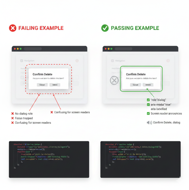
Explanation of Success:
role="dialog": This explicitly informs assistive technologies that the element is a user-focusable, interactive dialog container, triggering the correct announcement (e.g., “Confirm Delete, dialog”).aria-modal="true": This is critical. It signals that content outside of this dialog is dimmed and inert (should not be accessible to the keyboard or screen reader) until the dialog is closed.aria-labelledby="dialog-title": This links the dialog container to its title (<h2>), providing the primary, concise name for the dialog.aria-describedby="dialog-desc": This links the container to its main instructional content (<p>), providing an optional longer description for the user.
WCAG Success Criterion: 4.1.2 Name, Role, Value
Focus is not managed correctly
Focus management failures occur when the dialog opens but keyboard focus remains on the underlying page, or when focus escapes the dialog while it’s open.
Failing example:
The dialog opens, but the focus remains on the trigger button behind the modal overlay, making it impossible for keyboard users to interact with the dialog.
Passing example:
When the dialog opens, focus moves to the first focusable element within the dialog (or the dialog itself), and tabbing is constrained within the dialog until it closes.
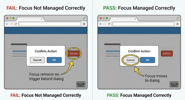
Important Note: Focus Return on Close
When the dialog closes, focus should be returned to the element that triggers the dialog.
Warning:
- Ensure that the trigger element still exists in the DOM when closing the dialog.
- If the trigger has been removed dynamically (e.g., through DOM manipulation), attempting to return focus to it can cause errors or focus loss.
- Verify the trigger element is present before setting focus back to it.
WCAG Success Criterion: 2.4.3 Focus Order
Accessible name does not match visible text
Dialog buttons and controls must have accessible names that contain their visible label text to support speech input users.
Failing example
A close button shows “×” visually but has aria-label="Close popup window":
<button aria-label="Close popup window">×</button>
Passing example:
The accessible name should begin with or exactly match the visible text:
<button aria-label="Close">Close</button>
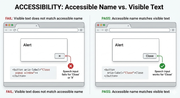
WCAG Success Criterion: 2.5.3 Label in Name
Focus becomes obscured
WCAG 2.2 introduces new requirements ensuring focused elements aren’t hidden by sticky headers, footers, or other overlapping content.
Failing example:
A focused button in the dialog is completely hidden behind a sticky header when the dialog scrolls.
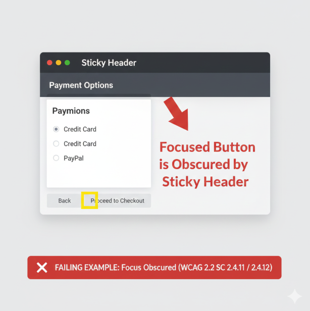
Passing example:
Focused elements within the dialog remain at least partially visible (Level AA) or completely visible (Level AAA).
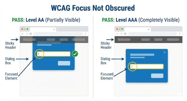
WCAG Success Criterion: 2.4.11 Focus Not Obscured (Minimum)
WCAG Success Criterion: 2.4.12 Focus Not Obscured (Enhanced)
Dialog cannot be closed accessibly
Users must be able to close dialogs using keyboard methods, typically the Esc key, in addition to any visible close buttons.
Failing example:
Dialog can only be closed by clicking on a small “×” button with a mouse.
Passing example:
Dialog supports Esc key closure and has clearly labeled close options that work with keyboard navigation.
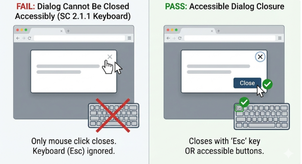
Exceptions:
There are cases where dialogs cannot be closed with the Esc key, such as legal notices that require user acknowledgment through activating a button before closing.
WCAG Success Criterion: 2.1.1: Keyboard
Step-by-Step Validation Process
1. Verify Semantic Structure
Check for proper ARIA implementation:
- Dialog container has
role="dialog" - Modal dialogs include
aria-modal="true" - Dialog has
aria-labelledbypointing to its title - Dialog has
aria-describedbyfor additional context when needed
2. Test Keyboard Navigation
For focus management validation, check that:
- Focus moves into the dialog when it opens
- Tab and Shift+Tab cycle through focusable elements within the dialog only
- Focus cannot escape to background content while dialog is open
- The Esc key closes the dialog
- Focus returns to the triggering element when the dialog closes
- Background content does not scroll while the dialog is open
3. Screen Reader Testing
For assistive technology validation, check that:
- Screen readers announce the dialog role and title when opened
- All dialog content is available to screen readers
- Error messages and form validation are announced properly
- To ensure coherent screen reader experience, dialog markup should appear near the end of the DOM, and all elements should be in logical tab and reading order.
- Background content becomes inert and unavailable to screen readers
Note: Some screen readers allow users to “escape” modals using virtual cursor mode. While you cannot prevent virtual cursor navigation, ensure that background content is inert and not reachable via tab stops.
4. Label and Name Validation
For speech input compatibility, check that:
- All interactive elements have accessible names that contain their visible text
- Button labels are descriptive and match what users see
- Form controls within dialogs are properly labeled
5. Visual Focus Testing
For focus visibility validation, check that:
- Focus indicators are clearly visible on all interactive elements
- Focused elements are not entirely obscured by other content (Level AA)
- For enhanced compliance, focused elements are not partially obscured (Level AAA)
Notes:
Testing Tools and Methods
Automated Testing
Automated testing tools like ARC Toolkit can identify certain basic structural issues but remember that even the best automated tools can only catch a relatively low percentage of WCAG failures. This is especially true for dialogs.
Manual Testing Methods
- Keyboard-only navigation: Navigate the entire dialog using only keyboard
- Screen reader testing: Test with NVDA, JAWS, or VoiceOver
- Speech input testing: Verify voice commands work with visible labels
- Focus visibility: Ensure focus indicators meet contrast and size requirements
- Scrolling: Confirm that body scrolling is disabled when the dialog is open and re-enabled when the dialog closes.
Usability Testing with Real Users
Include users with disabilities in your testing process, as they can identify issues that technical testing might be missed.
Best Practices for WCAG 2.2 Conformance
Essential Implementation Guidelines
- Use semantic HTML when possible: The native
<dialog>element handles many accessibility requirements automatically, including focus management and backdrop behavior. - Implement proper focus trapping: Ensure users cannot accidentally navigate outside the dialog while it’s open.
- Provide multiple ways to close: Support both Escape key and visible close buttons.
- Design clear focus indicators: Meet WCAG 2.2 enhanced focus visibility requirements.
- Test with real assistive technology: Automated tools alone are insufficient for dialog validation.
Common Validation Scenarios
Marketing/Newsletter Dialogs
These often appear automatically, but they must not violate focus order requirements or trap users unexpectedly.
Form Validation Dialogs
These must announce errors accessible and maintain focus on the problematic field or error message.
Confirmation Dialogs
Confirmation dialogs should clearly describe the action being confirmed and provide obvious ways for users to proceed or cancel.
Conclusion
By following this comprehensive validation approach, you can ensure your dialogs meet WCAG 2.2 requirements and provide accessible experiences for all users. Remember that dialog accessibility is not just about passing automated tests—it’s about creating usable experiences for people who depend on assistive technologies to interact with your content.