Disappearing something on a page permanently is simple: just remove the content from the DOM and move on. But what if you want to hide something temporarily? In that case, you may need certain properties, attributes, or elements that can hide the content and reveal it again when needed.
Sometimes, you may want to hide content only from sighted users, only from assistive technologies, or simply avoid exposing the semantic structure without affecting the visual layout.
Sounds tricky, right?
Different techniques exist for different needs. From an accessibility perspective, each hiding method behaves differently; some remove content from assistive technologies entirely, while others keep it available to screen readers. Choosing the right technique matters for keyboard users, screen reader users, and even for how accessible names and descriptions are calculated.
This article explains these techniques, why you might use them, how they affect accessibility, and includes simple, real-world examples where they fit best.
Removing content entirely
display: none
display: none is a CSS style that removes an element completely from both the visual layout and the accessibility tree. In other words, it behaves as if the element doesn’t exist; it isn’t visible on the page, and screen readers can’t detect it.
This is useful when content should not be available until a user takes an action, such as opening a dropdown menu, modal, or tab panel. When the user activates the control, you switch display: none to a visible value (like block), making the content available to both sighted users and screen reader users at the same time.
Example
<button aria-expanded="false" aria-controls="main-menu">Menu</button>
<ul id="main-menu" style="display: none;">
  <li><a href="#home">Home</a></li>
  <li><a href="#about">About</a></li>
</ul>
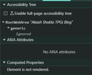
In the screenshot below, you can see that the <ul> element is completely ignored in the accessibility tree, and it is not rendered in the computed styles panel, confirming that it is removed from both the DOM’s visual and accessibility layers.
The hidden attribute
The hidden attribute is an HTML attribute that indicates an element is not relevant or should not be shown to the user. When applied, browsers automatically apply display: none to that element.
Just like display: none, an element with the hidden attribute is removed from both the visual layout and the accessibility tree. This means screen readers cannot access it, and it does not appear on the page.
Use the hidden attribute when you want to temporarily hide content until it becomes relevant, for example, inactive tab panels, collapsible sections, or UI content that appears only after user interaction. To make the content available later, simply remove the hidden attribute using JavaScript.
Example
<button aria-expanded="false" aria-controls="details">Show Details</button>
<div id="details" hidden>
  <p>Here are the details...</p>
</div>
Hiding visually but keeping layout
visibility: hidden
In most modern browsers, the visibility: hidden CSS property hides an element from sighted users and removes it from the accessibility tree, which means it is not exposed to assistive
technologies, but keeps its space reserved in the layout. The element is invisible and inaccessible, yet it still affects the page’s structure.
This makes visibility: hidden different from display: none and the hidden attribute, which removes elements entirely from both the visual layout and the accessibility tree.
Use visibility: hidden when you need to hide something temporarily, visually and programmatically, while preventing surrounding content from shifting.
There is a well-explained article about visibility: hidden: The anatomy of visually-hidden
Example
<ol>
  <li id="step1">Step 1: Enter Personal Details</li>
  <li id="step2" aria-current="page">Step 2: Verify Email</li>
  <li id="step3" style="visibility: hidden;">Step 3: Complete Registration</li>
</ol>
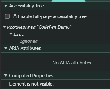
In this registration flow, only the current and completed steps are shown. The upcoming step (Complete Registration) uses visibility: hidden. This keeps its space in the layout, so the step list doesn’t jump or shift when each step becomes visible.
In a screenshot, you would notice that the element is ignored in the accessibility tree, and the computed properties show that the element is not visible while still occupying space.
Hiding from assistive technology only
aria-hidden="true"
The aria-hidden="true" attribute tells assistive technologies, such as screen readers, to ignore an element, even if it is visible on the screen.
Unlike display: none or visibility: hidden, the element still appears visually and still takes up space in the layout. Only assistive technologies are instructed not to expose it.
This makes aria-hidden="true" useful when something is visually helpful but not meaningful for accessibility, such as decorative icons, duplicate labels, or repeated text.
Note: Do not use aria-hidden="true" on interactive elements (links, buttons, form controls) because screen readers and keyboard users still need to interact with them. Hiding them from the accessibility tree will make them unusable for assistive technology users.
Example 1: SVG with aria-hidden="true"
<button>
<svg aria-hidden="true" xmlns="http://www.w3.org/2000/svg"
viewBox="0 0 24 24"
width="24" height="24"
style="vertical-align: middle; display: inline-block;">
<title">magnifying glass</title>
<circle cx="11" cy="11" r="6" fill="none" stroke="currentColor" stroke-width="2" />
<line x1="16.5" y1="16.5" x2="21" y2="21" stroke="currentColor" stroke-width="2" stroke-linecap="round" />
</svg>
Search
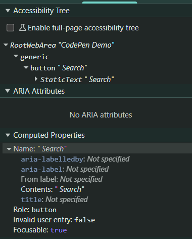
</button>In this example, the magnifying glass icon is purely decorative. Sighted users can see it, but screen readers skip it entirely.
The screen reader will announce: “Search, button.”
Example 2: SVG without aria-hidden="true"
<button>
<svg xmlns="http://www.w3.org/2000/svg"
  viewBox="0 0 24 24"
  width="24" height="24"
  style="vertical-align: middle; display: inline-block;">
  <title>magnifying glass</title>
  <circle cx="11" cy="11" r="6" fill="none" stroke="currentColor" stroke-width="2" />
  <line x1="16.5" y1="16.5" x2="21" y2="21" stroke="currentColor" stroke-width="2" stroke-linecap="round" />
</svg>
Search
</button>
In this example, the magnifying glass icon is exposed to the screen reader users. As a result, the screen reader will announce: “magnifying glass Search, button.”
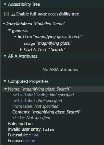
Note: Example 2 is included only for demonstration purposes and is not recommended from an accessibility perspective.
Removing semantics
role="presentation" or role="none"
The attributes role="presentation" and role="none" are used when you want to remove the semantic meaning of an element while keeping it visible in the UI.
Both roles behave the same: they tell assistive technologies to treat the element as if it has no semantic role, unless the element is focusable or interactive.
This does not hide content. Instead, it changes how screen readers interpret the structure. Use it when the native semantics are incorrect for the content.
The element still appears visually and is still part of the layout, but its semantic meaning, such as “table,” “list,” or “image”, is ignored by screen readers.
This is useful when:
- An element’s semantics don’t match its visual purpose
- A visually structured container (like a table or list) is used only for layout
- Decorative images don’t provide meaningful information
Example 1: Using a table for layout
<table role="presentation">
<tr>
<td><strong>Name:</strong></td>
<td>Stifen</td>
</tr>
<tr>
<td><strong>Email:</strong></td>
<td>Stifen@example.com</td>
</tr>
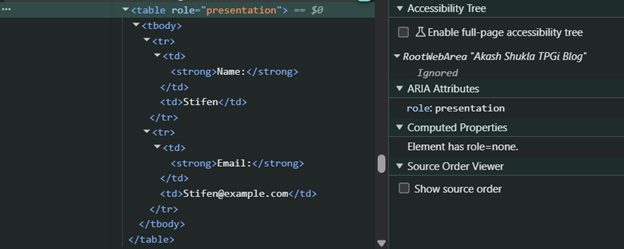
</table>In this case, the table is being used purely for layout, not for tabular data.
With role="presentation", the screen reader no longer announces:
- “Table”
- “Row”
- “Column”
- “Cell”
Instead, it treats the content as plain text.
In the following screenshot, the table structure is ignored in the accessibility tree, confirming that assistive technologies no longer interpret it as a data table.
For a deeper explanation of layout tables, you can refer to the article: Tables: Beyond Rows and Columns.
Example 2: Decorative image
<img src="divider.png" alt="" role="presentation">
Here, the image is only a visual divider. Using role="presentation" (or an empty alt) ensures screen readers don’t announce it as an image, keeping the experience clean.
Note: Never apply these roles to interactive elements (links, buttons, form controls). Doing so removes their semantic meaning and breaks accessibility.
Hiding visually but keeping accessible
.sr-only
By default, assistive technologies ignore elements hidden using display: none, visibility: hidden, or the hidden attribute. These methods remove the element visually and from the accessibility tree, making it inaccessible to screen reader users.
However, developers often need to visually hide text while still exposing it to assistive technologies, for example, to provide additional instructions, clarify link purpose, or improve accessible names. In these cases, the hidden text must remain in the DOM and be readable by assistive technologies.
A common solution is the “visually hidden” or “sr-only” CSS pattern:
.sr-only {
  position: absolute;
  width: 1px;
  height: 1px;
  margin: -1px;
  padding: 0;
  border: 0;
  clip: rect(0 0 0 0);
  clip-path: inset(50%);
  overflow: hidden;
  white-space: nowrap;
}
Use .sr-only when you want the text to be announced by a screen reader but remain invisible to sighted users.
Example: Enhancing link meaning with visually hidden text
<div>
  <p>Evolve your accessibility processes and future-proof your efforts with manageable audits, advanced technology, and expert guidance. <a href="https://www.tpgi.com/accessibility-solutions/managed-services/">Learn more.<span class="sr-only"> about Managed Services</span></a></p>
</div>
It will look like this:

What this achieves
- Visually: Sighted users only see the link text “Learn more.”
- For screen readers: The full accessible name becomes “Learn more about Managed Services.”
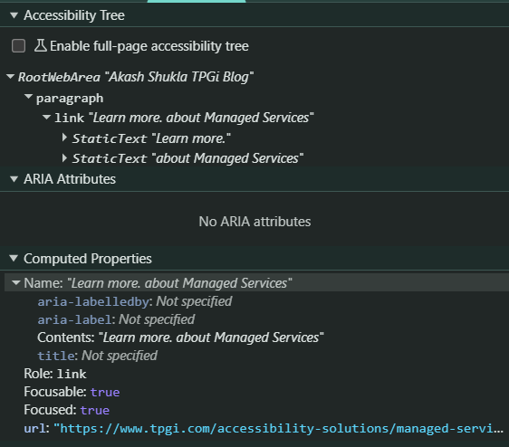
In the accessibility tree (as shown in the referenced screenshot), the hidden text “about Managed Services” remains exposed, and the final accessible name is computed as: Learn more. about Managed Services
Hidden Elements in Accessible Name Computations
When building accessible interfaces, developers often assume that hidden text (using display: none, visibility: hidden, aria-hidden="true" or the hidden attribute) is always ignored by screen readers.
That’s generally true, but Hidden elements can still contribute to an accessible name or description when they are referenced correctly using aria-labelledby or aria-describedby.
This is because assistive technologies often compute the accessible name by traversing the referenced nodes, even if those nodes are hidden, as long as the hidden node is part of the traversal chain.
Below are simple scenarios demonstrating how this works:
Note: All examples below use aria-hidden="true", but the same behavior typically applies to all hiding techniques (display: none, visibility: hidden, or the hidden attribute), although in many browsers and assistive technologies, hidden elements referenced via aria-labelledby or aria-describedby can still contribute to accessible name or description computation
In each scenario, the term “hidden” means the element is not exposed to assistive technologies.
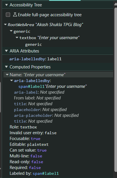
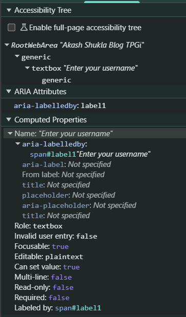
Scenario 1: Hidden text is included in the accessible name
<span id="label1" aria-hidden="true">
  <span id="label2" aria-hidden="true">Enter your username</span>
</span>

<input aria-labelledby="label1">
The input is labeled by label1. label1 is hidden, but it contains label2, which is also hidden. Because the accessible name calculation starts with the referenced element (label1), the traversal includes its descendants. As a result, the hidden text “Enter your username” is still used in the accessible name.
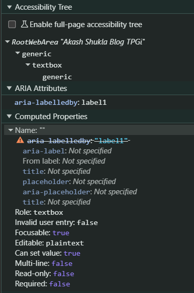
Scenario 2: Hidden text is not included in the accessible name
<span id="label1">
  <span id="label2" aria-hidden="true">Enter your username</span>
</span>

<input aria-labelledby="label1">
The input is labeled by label1. label1 is not hidden, but label2, which contains the actual text, is hidden. Since the traversal starts at a visible node (label1), and the only meaningful text is inside a hidden child (label2), screen readers do not use the hidden text as an accessible name.
Scenario 3: Hidden container, visible label text – accessible name works
<span id="label1" aria-hidden="true">
  <span id="label2">Enter your username</span>
</span>

<input aria-labelledby="label1">
The input references label1, which is hidden. But label1 contains label2, and label2 is exposed. Because the traversal starts at label1, the algorithm moves into its children and finds text. As a result, the accessible name “Enter your username” is exposed to the assistive technologies.
Key Takeaways – Comparison of Hiding Techniques
|
Technique |
Visible |
In accessibility tree |
Takes layout space |
|
|
❌ |
❌ |
❌ |
|
|
❌ |
❌ |
❌ |
|
|
❌ |
❌ |
✔ |
|
|
✔ |
❌ |
✔ |
|
|
❌ |
✔ |
❌ |
|
|
❌ |
✔ (no semantics) |
✔ |
Additional Techniques Worth Knowing
While the methods above are the most commonly used, there are a few other techniques developers often encounter or misuse. A basic understanding of these helps avoid common accessibility pitfalls.
inert
- Removes content from the accessibility tree
- Prevents keyboard focus
- Disables all user interaction
- Commonly used for background content when modals are open
Use case: Temporarily disabling entire sections of the page (e.g., when a modal dialog is active).
opacity: 0
- Hides content visually
- Does NOT remove content from the accessibility tree
- Elements remain focusable and interactive unless otherwise restricted
Important: Developers often assume this behaves like display: none, but it does not. Screen readers can still access this content.
position: absolute; left: -9999px
Off-screen positioning:
- Moves content out of the visible viewport
- Keeps content available to screen readers
- Is often used as part of visually hidden techniques
Use case: Providing additional context for screen reader users without affecting visual layout.
display: contents
- Removes the element's box from the layout
- Keeps child elements rendered and exposed to assistive technologies
- Can affect semantics depending on browser and element type
Caution: This can lead to unexpected accessibility issues, especially with semantic elements (like lists or tables), as some browsers may not fully preserve semantics.
Conclusion
Understanding how different hiding techniques interact with assistive technologies is essential for building accessible and predictable user interfaces. While hiding content may seem simple, each method carries specific implications for screen readers, keyboard navigation, layout stability, and accessible name computation.
By choosing the right approach, whether it's display: none, hidden, aria-hidden, visually hidden text, or roles, you ensure that content remains meaningful for all users. Thoughtful use of these techniques not only improves accessibility but also creates more consistent and robust user experiences across devices and assistive technologies.
Resources
- Accessible Name and Description Computation 1.2
- Understanding Success Criterion 1.3.1: Info and Relationships | WAI | W3C
- Understanding Success Criterion 1.3.2: Meaningful Sequence | WAI | W3C
- Tables: Beyond Rows and Columns
- HTML5 Accessibility Chops: hidden and aria-hidden
- The anatomy of visually-hidden
- Get Ready for `display: contents;`
- HTML inert global attribute